How we helped users find “guides” and spend 50% less time!

Project summary
Product: Contextual web-based dashboard home page
Problem: “Guides” are what Contextual call their “in-app messages”. Once the “guides” are created it’s very difficult to find them unless the user knows their names
Outcome: Project will be implemented in the second quarter of 2024 but so far it has resulted in a shift in the team’s perspective on the limitation of MVP mindset and importance of considering the full user journey.
Role: Product designer
Team: Product manager, JS engineering team based in Vietnam
Contextual 2022-2023
It was in the middle of usability testing when I realised how one of the users has used emojis and work arounds to find the guides easier. Having provided icons and basic filters we had assumed that the users won’t struggle. After some investigation we realised although mechanisms like “groups” exist, but they are not used to sort the list or help with categorisation.
As a result of this: we conducted a series of research, iteration and testing that turned to a large intertwined project on the dashboard side.
Process

Problem verification

Analysis and initial ideation
Initial wire framing
Testing of iterations

Final design
Problem verification
In order to verify the problem, we conducted a set of research and analysis which lead to defining the project’s success metrics.
Usability testing:
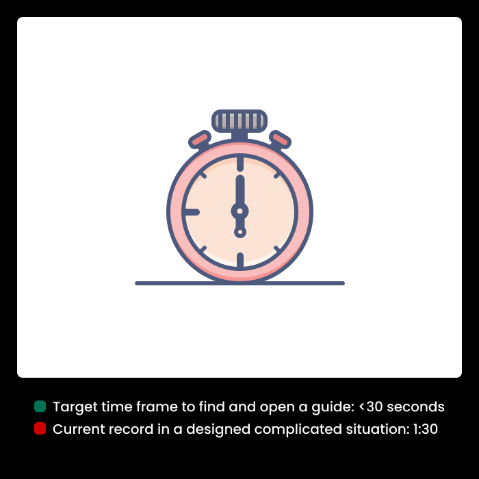
In a designed scenario it took users up to 1:30 to find a guide!
We designed and conducted a controlled situation in which the users could see a published guide with some major errors and typos (built up user frustration); but made it very difficult for them to find the guide. They ended up going through the list and check them one by one.
User journey analysis

Incomplete path to edit the guides and one way navigation system. Users must be able to analyse findings and change pre-existing guides.
Hypothesis and success metrics definition
Analytics show that users tend to create new guides rather than editing the existing ones. The hypothesis is that changing the navigation and making it easier for the users to find guides based on different features might increase the number of edited guides and reduce the number of new guides created by users.
In addition to that, time it takes the users to find a guide, viewing the analytics by the users and activation of the expired guides can be good measures of the success of the project.
| Old design | New design | |
| The number of edited guides v.s. new guides | 15% | |
| The average time it takes a user to find a guide | >1:30 minutes | |
| Time it takes to reactivate expired guides | over 3 days | |
| Guide analytics features viewed | 30% | |
| Meeting of the quarterly business goal | Retention of the current users |
Solution design
1. Primary competitors allow separate dashboard creation
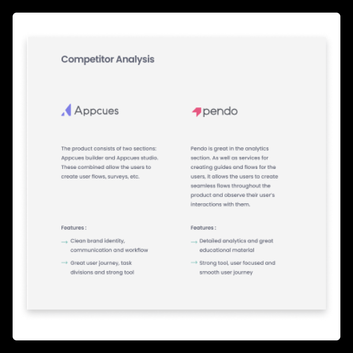
Contextual has limited resources and this solution doesn’t seem viable for us.
2. Standard filtering and searches through the lists

Relying on best practices might be our solution.
3. Best practice calls for a set of main and sub-categories

4. Card sorting

There are three main categories based on selection options
5. Initial wireframe

Product team decided to limit the number of features on stage 1 since it might cause confusion.
6. Initial design review

Outcome: based on the choices we should distinguish between check boxes and radio buttons
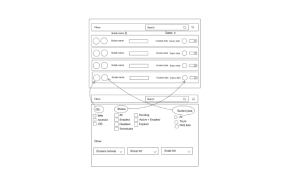
New components layout
Iteration 1:
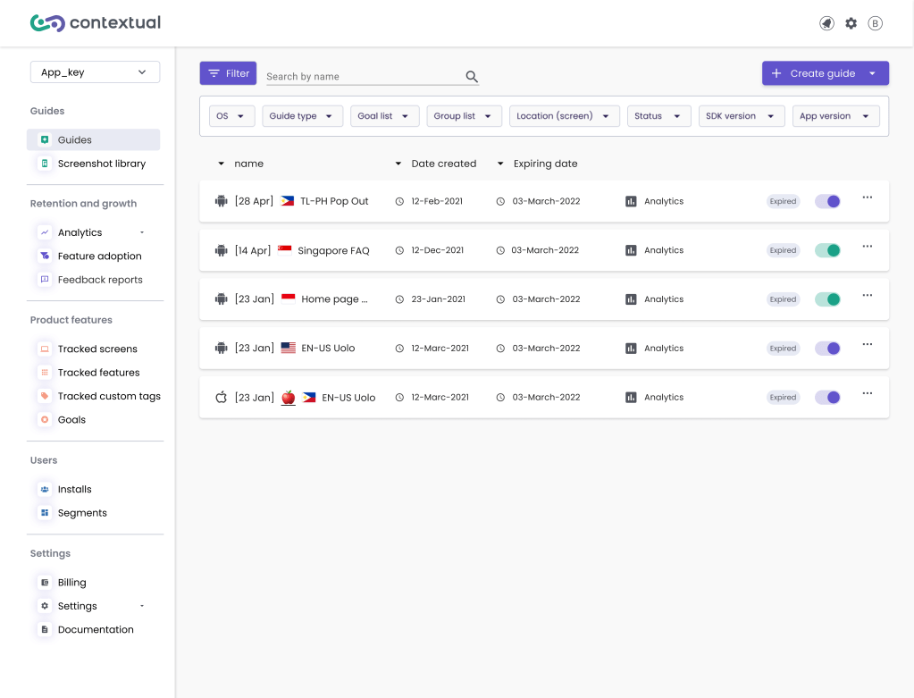
The filters will be a separate collapsible part above the guide list. We have given equal importance to both the OS and guide type. This helps us to clearly see the unique nature of each guide.
Also, we added a feature to let users sort the guide list by expiration or creation date, or alphabetical order. They can do this by clicking on the corresponding arrows.
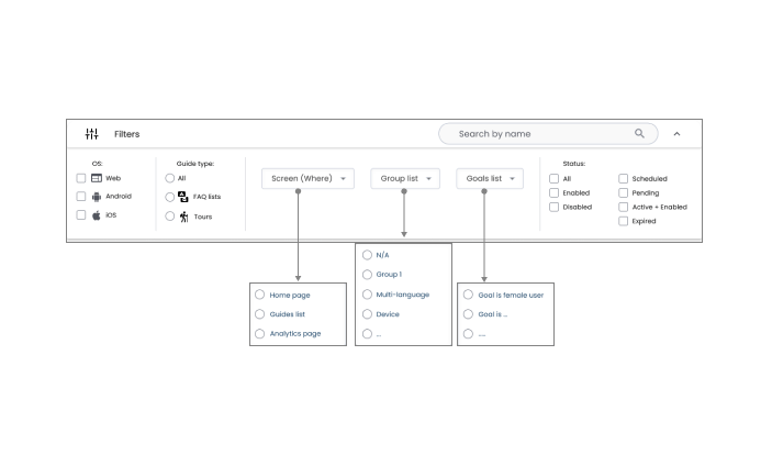
Iteration 2:
After reviewing the design with the engineers, it was suggested that using a button to launch the filters is a better idea than drop down filter. Perks are: it takes less screen realestate, doesn’t require new components design and is simpler for the users to interact with.
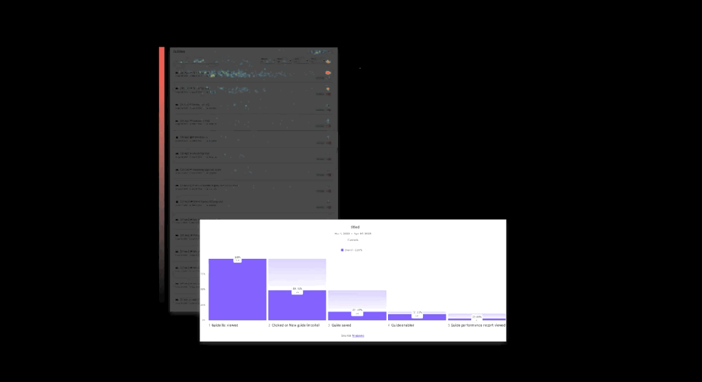
Usability testing
After we made the initial prototypes, we tested them for usability. We did tests both internally and with a selected group of users. The results showed:
- Initial problem can be solved: the users find the guides much easier as predicted.
- The filter icon and the overall appearance are not familiar to the users and they take a second to click on it.
- In order to sort the list we need to implement the sorting features and the filtering might not work here.
As for the sorting systems, we decided to break the project into two phases and implement the sorting system in the next phase.
| Old design | New design | |
| The number of edited guides v.s. new guides | 15% | Users were notified about this, it’ll be monitored |
| The average time it takes a user to find a guide | > 1:30 | <40 |
| Time it takes to reactivate expired guides | over 3 days | This is defined as a separate project and it’ll be implemented as part of the message stream project |
| Guide analytics featured viewed | 30% | It will be monitored |
| Meeting of the quarterly business goal | Retain the existing users | To be defined |
Outcome
- The button filter is designed to reduce user confusion. It also helps to save screen space.
- This project is part of a broader sprint aimed at enhancing the usability of Contextual products.
- We are discussing adding group names to the left side of the list. We are investigating this further at later stages.
The final design is scheduled for release in the 2nd quarter of 2024
Reflections
- We predict that by implementing the new filtering system, the users tend to find the guides faster. This will result in: feeling more in control, relying on analytics and other features of the product, more interaction with the designs and ultimately increase in the end-user’s engagement with the new guides.
- Working with developers in different time zones has challenges. This was a good opportunity to improve our clear communication, thorough briefings, and skilful time management.
- Contextual is initially designed by developers with a MVP mindset. This project is a great example of how this mindset impacts user’s experience.
