Contextual – May 2023
Role: Product designer
My role is the product designer in this project. I worked closely with the product owner and the lead JS engineer on this project. I also worked with our front-end developer based in Vietnam.
Overview

A product like Contextual has so many layers in which both the success and error can happen. When dealing with the user problems we realised a lot of the wins in the product go unnoticed. Also, many errors can be stopped by letting users know the issues or asking them to take action.
Problem
 The messages in Contextual are inconsistent in style
Success and failures of the product go unnoticed and there’s no way to send notifications to the users

In so many instances we struggled to create designs for new messages to the users that didn’t exist before. The need for a messaging guideline is agreed on among the team.
There are so many instances that the users fail to accomplish their tasks. After investigating, we’ve found the problem. It could be fixed by a simple notification or error prevention. Users also need to know their successes and get general notifications.
Customer pain points and needs
Communication is insufficient. When users take an action, they’re not told the outcome.
The info on the state of the screenshots and targeting is not consistent. It’s dismissible and frustrates users.
The design of banners, error messages, dialogue boxes are inconsistent.
Banners are traditionally bold and bulky. But, in this case they look old and feel off-putting.
Clients need success, error, and warning messages. They need these to know their state in the product.
Clients should be able to dismiss the irrelevant or repetitive messages to them.
We need consistent design for our messages.
Business pain points and needs
Outdated screenshots or SDKs are the cause of a lot of failures of the product.
Guides might expire and the users won’t be notified to reactivate them or reassign them to the right users.
Guides might achieve their goals and the users need to be notified of that.
We need to inform the users of the changes they require to make in order for the product to work sufficiently.
We need to alert the users about the expiring guides.
We need to remind users of the wins in the product for positive reinforcement.
Project principles
Just in time, just enough, just for me
Messages should be timely, provide relevant information and targeted at the right user

Respect user’s needs
Messages should not interrupt the user’s intent, goals, or actions. They can only interrupt if the action is critical and timely.

Language should be proportionate
Both visual and literal language should be present. Messaging components, interface and placement should reflect content information and intent. This is specially important in the usage of images.

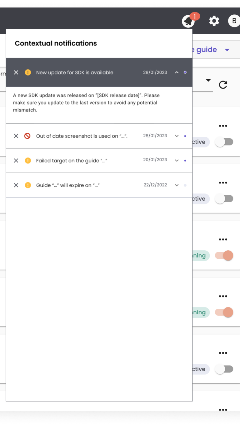
A message stream
A series of communication is worth keeping at message-stream communicating to the users. This keeps a reverse history of the messages. It also tracks the key notifications, warnings, and wins.
Phases
Phase 1
Milestones
- Create the handbook for messaging reference
- Review the existing messaging systems and create the required tickets
- Set the culture to review design decisions before shipping. Make sure they match the standards.
Current state breakdown
Messaging types
- Banners
- Dialogues
- Announcement cards
- Snackbars

These components are our first attempt to systematise how we message in the unified app. They cover when, why, and to whom.
Our goal is to help the team understand the use of each messaging type. We also aim to give users the right information at the right place and time.
Elements breakdown

We designed an all-in-one version of the message component. It was inspired by our main asset reference, Material design 3.0 components.
* This will act as a reference for all the future designs.
Snapshot of different designs
The reference asset for the team is Material 3.0 components. Here’s snapshot of the standardised design for the identified components.
Dialogue box
Snackbar
Announcement card
Banners
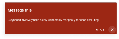
Banners
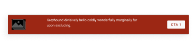
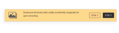
Story: As a product, we want to let the users know about the state of their account
Placement: Embedded, usually at the top or bottom of the screen.
Surface: Contextual, at the home screen.
Content guidelines: Use as little and simple text, 2 lines max. You can use a header or not.
Purpose: Banners should show the user’s account state or other general info. Interaction: Dismiss for general banners, no actions for errors or warnings. Measured via: Impression rate and click through if action needed.
Warning
General information

Error
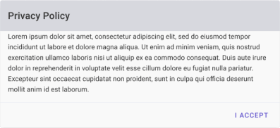
Dialogue boxes
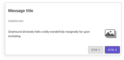
Story: As a user I want to confirm if I’d like to proceed with an action or if I’m taking risk with doing something.
Placement: Pop-up – at the time of required action from the user – conveying information or errors
Surface: Prioritised, Pop-up
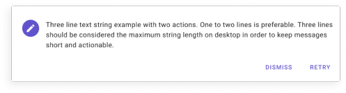
Content guidelines: Related image, image heavy, 2 lines max content, Must have a title, subtitle is encouraged, should fully explain the situation and required action
Purpose: Dialogue boxes should be used in case an action is required by the users and the states are clear.
Interaction: Depending on the message the CTAs should trigger different actions.
Measured via: Impression rate and click through if action required.
General information
Error
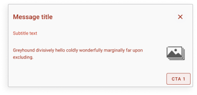
Warning
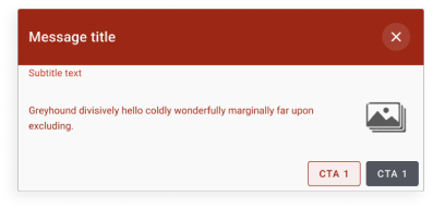
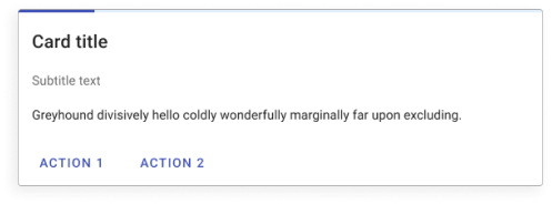
Communication cards
Story: As a user, I want to know the state of a progress I’ve triggered, e.g. download CSV or Saving a guide.
Placement: Pop-up – at the time of situation happening at Contextual – conveying information or errors
Surface: Prioritised, Pop-up
Content guidelines: Progress icon, Related image, 2 lines max content, Must have a title, subtitle is encouraged, should fully explain the situation and required action
Purpose: Dialogue boxes should be used in case an action is required by the users and the states are clear.
Interaction: Depending on the message the CTAs should trigger different actions, usually accept or dismiss
Measured via: Impression rate and click through if action required.
General information
Error

Warning
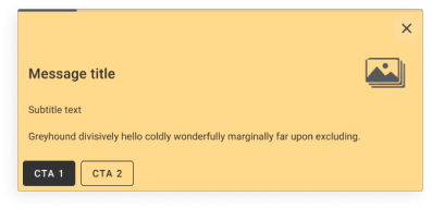
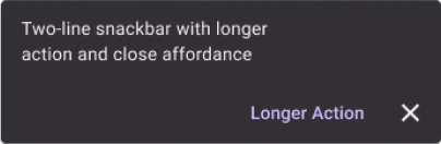
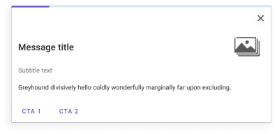
Snackbars
Story: As a user I want to be informed if the action that I took is successfully completed or if it’s facing an error.
Placement: top of the screen, Pop-up – Disappears automatically.
Surface: Prioritised, Pop-up, mostly no action required. In case there’s an action required there should be a dismiss icon available.
Content guidelines: 2 lines max content, Must have a title, subtitle is not required
Purpose: At the time of a successful or unsuccessful process, at general state it appears and disappears just to convey the information.
Interaction: action required at the time of error or warning: Accept button and dismiss icon
Measured via: Impression rate and click through if action required.
General information

Error
Warning

Accessibility
Stark: Some colours we chose don’t meet contrast standards for accessibility.
We used the suggestions from the stark plugin. We made some changes to our design systems to meet the accessibility requirements. This lets users with different vision abilities see and use our dashboard.

Internal team announcement
Impact
- The playbook is given to the team as a reference. It has been used since and acted as a source of information and design style guide.
- We review the current messaging style. Then, we update it to meet the guidelines and have a consistent look and feel.

Phase 2
Milestones
- Complete the design for message streams
- Implement the design by the engineers
- Review the impacts and run user testing sessions
- Evaluate and make potential changes in the design
Message streams
Types of messaging to send/keep via the message stream
- New app version release and user needs to update the screenshots
- Expiring guides
- Expired guides
- Goals achieved
- New device added to preview mode
- Target loss at guide level
Elements breakdown
Potential details of each component

We designed the message stream notification bar using Material design 3.0 components. We were inspired by our main asset reference. This is to act as a drop down from the top menu bar at Contextual dashboard.
Impact
- We will measure the impact by counting the clicks and interactions. They will be counted during a period of time.
- The message stream can/should be used for user support purposes. This is to be measured by internal team surveys and reflections.
 Crafted by Bess